Text Settings
The text appearance settings control how the customer’s typed text looks in the Personalizer canvas overlay.
Font
| Setting | Description |
|---|---|
| Font family | The typeface used for this text layer. Defaults to the Option Set’s design font. You can override it here with any Google Font or custom uploaded font. |
| Font size | Size of the text in pixels. This is the rendered size at full image width — on smaller screens the canvas scales down proportionally. |
| Font weight | Normal, medium, semi-bold, or bold |
| Font style | Normal or italic |
All of these live under Text Appearance in the element’s Personalizer tab, alongside a live Personalizer Preview:
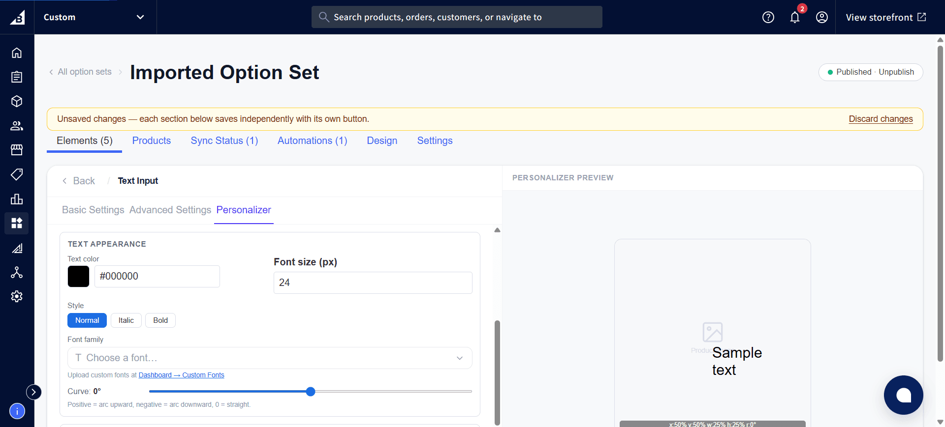
Custom fonts in the Personalizer
If a custom font is selected and the Personalizer is enabled, the app automatically loads the custom font on the product page before displaying the text on the canvas. This ensures the live preview and the saved design image display in the correct typeface.
If you want customers to choose their own font, pair a Font Picker element with the text element — the Personalizer automatically detects which font the customer has selected and applies it to the canvas text.
Color
| Setting | Description |
|---|---|
| Font color | The fill color of the text. Can be any hex color. Default is black (#000000). |
Layout
| Setting | Description |
|---|---|
| Text alignment | Controls how text aligns within the bounding box: Left, Center, or Right |
| Line height | Spacing between lines for multi-line text (1.0 = normal spacing, 1.5 = wider spacing between lines) |
Curve
The Curve setting bends the text along a circular arc, useful for text on rounded products, ring engravings, or decorative curved layouts.
| Value | Effect |
|---|---|
0° | Straight text (no curve) |
Positive (e.g., +60°) | Text arcs upward (like the top of a circle) |
Negative (e.g., -60°) | Text arcs downward (like the bottom of a circle) |
±180° | Full semicircle |
The curve value is in degrees and represents the arc angle. Higher absolute values create tighter curves.
Preview in the dashboard
The settings panel shows a live preview of how the curve will look. This is an approximation — the final rendering on the canvas uses the same geometry but may look slightly different at small font sizes.
Placeholder text
While the text input is empty (the customer hasn’t typed yet), the Personalizer can show placeholder text on the canvas so the customer can see the layout before they start typing. This is configured via the element’s Placeholder setting — the same placeholder text is used in both the input field and the canvas preview.