Radio Buttons
A list of options with a circular radio button beside each one. Only one can be selected at a time. All choices are always visible.
When to use
- 2–8 choices that should all be visible at once
- Clear single-choice selection (e.g., size: S / M / L / XL)
- When the customer benefits from seeing all options without opening a dropdown
General settings
| Setting | Description |
|---|---|
| Label | Field label |
| Required | Customer must make a selection |
| Help text | Guidance below the field |
| Layout | Vertical list (default) or horizontal wrap |
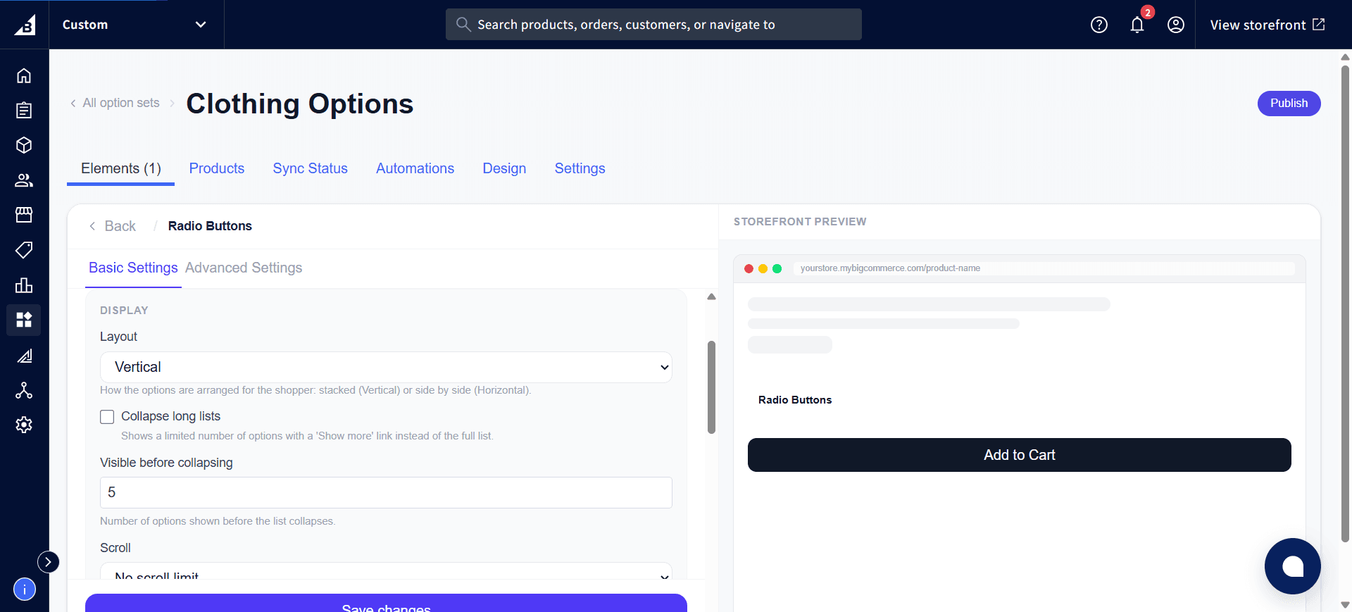
The Display section also has options for long lists — Collapse long lists shows a limited number of options with a “Show more” link, Visible before collapsing sets how many show before that happens, and Scroll caps how tall the list can grow:
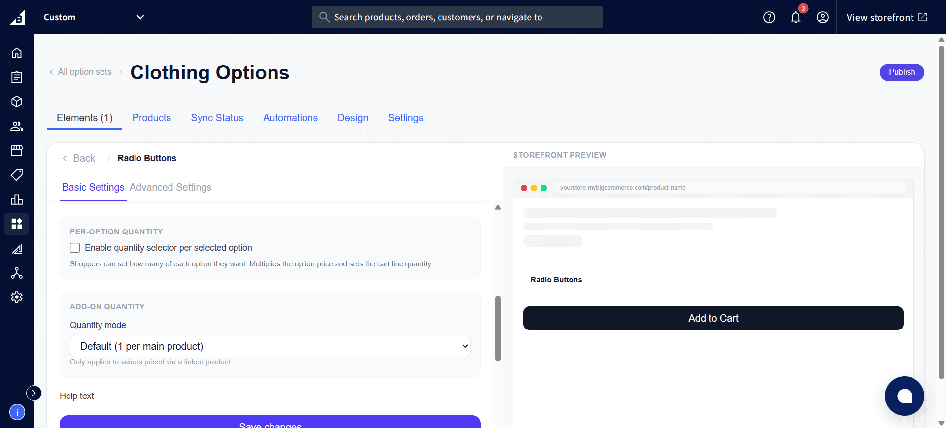
Scrolling further down shows Per-Option Quantity and Add-on Quantity, the same quantity-selector settings available on Dropdown:
Values tab
| Field | Description |
|---|---|
| Label | Text shown next to the radio button and in the order |
| Internal name | Admin-only |
| Description | Optional sub-text shown beneath the label — useful for descriptions like “Standard shipping: 5–7 days” |
| Default | Pre-select this option |
| Disabled | Greys out this option |
| Image | Optional thumbnail shown alongside the label |
| Price | Add-on price for this selection |
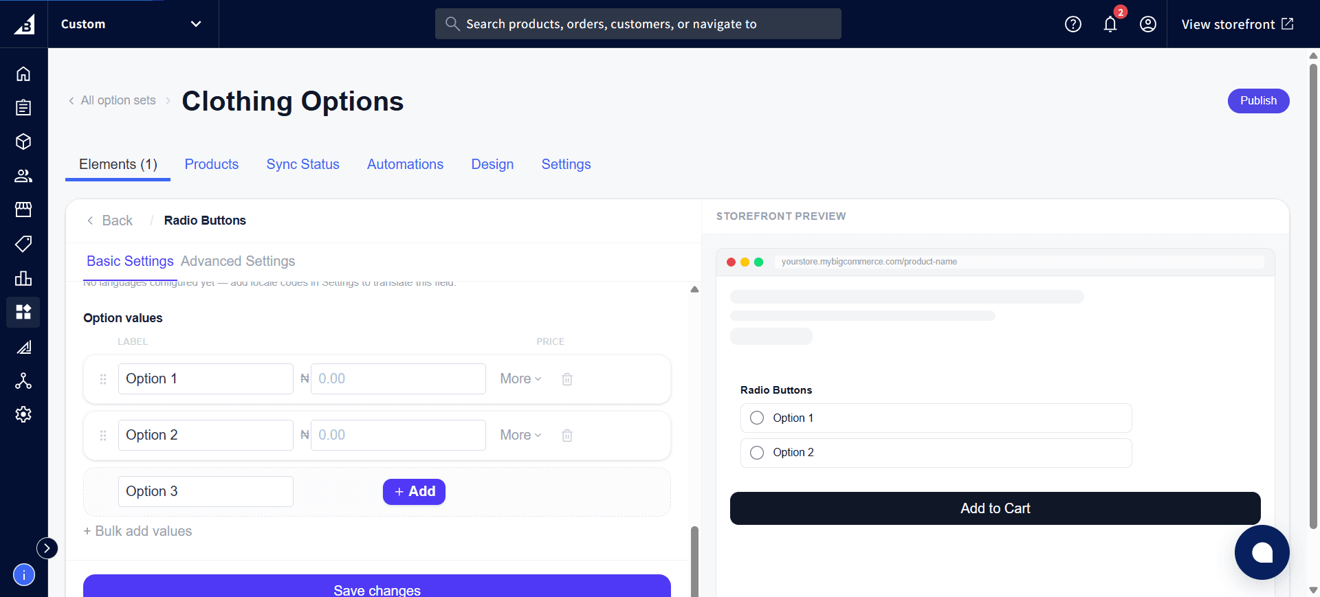
Click More on a value to see the same Price rule and If out of stock options described on the Dropdown page.
Storefront behavior
- Displays as radio buttons.
- One selection at a time
- The selected option is recorded on the order.