Tab
Groups elements into a tabbed panel layout. Customers click tab headers to switch between groups of related options.
When to use
- A long form that can be split into distinct steps (“Step 1: Personalization”, “Step 2: Delivery”)
- Option sets with two clearly separate categories of choices (e.g., “Design” and “Extras”)
- Any scenario where showing all options at once would be overwhelming
Structure
A Tab element acts as a container. You add Tab Panels inside it, each with a name. Elements inside each panel are only visible when that tab is active.
Tab element
  └── Panel: "Personalization"
      ├── Text Input: "Name"
      └── Color Swatch: "Thread Color"
  └── Panel: "Gift Options"
      ├── Switch: "Include gift card"
      └── Text Area: "Gift message"
Settings
| Setting | Description |
|---|---|
| Tab style | Underline (text with an underline on the active tab) or Folder (boxed tabs that look like folder tabs) |
| Default tab | Which panel opens by default |
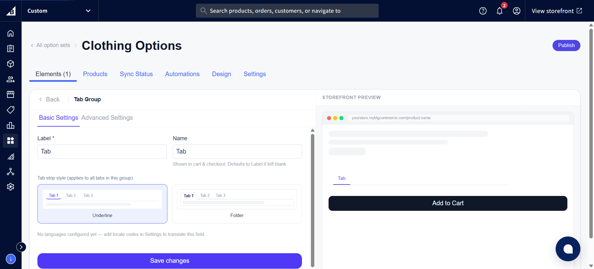
Per-panel settings
| Setting | Description |
|---|---|
| Name | Tab header label |
| Icon | Optional icon next to the tab name |
Notes
Important: If a required option is inside a tab the customer hasn’t opened, they’ll see a validation error when they try to add to cart — even though the field isn’t visible to them. To avoid confusion, place required options in the first (default) tab, or make options inside secondary tabs optional.
- Tab layout applies inside the widget only — the option set’s outer design settings still apply.