Accordion
An expandable/collapsible section with a clickable header. The customer clicks the header to reveal or hide the content inside.
When to use
- FAQ-style content embedded in the product page (e.g., “Sizing guide”, “How to measure”)
- Progressive disclosure of advanced options
- Hiding a large amount of secondary content that most customers won’t need
Settings
| Setting | Description |
|---|---|
| Title | Header text shown when collapsed |
| Default state | Expanded or collapsed on page load |
| Icon position | Show the expand/collapse arrow on the left or right of the title |
| Icon style | Arrow, plus/minus, or chevron |
| Allow multiple open | If multiple accordions exist, whether more than one can be open simultaneously |
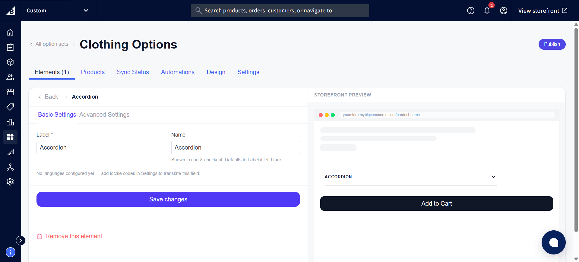
The Basic Settings tab holds the Label and Name — the display-specific settings above are on the Advanced Settings tab next to it:
Notes
Important: Options inside a collapsed accordion section are still required and validated when the customer clicks Add to Cart — even if the section is hidden. If you have required options inside an accordion, consider setting the default state to expanded so customers see them clearly.
- Heading, Paragraph, and Raw HTML are common choices for content inside an accordion
- The accordion itself doesn’t record any value on the order — the individual options inside it each record their own values normally.