Range Slider
A horizontal drag slider for numeric input. The customer drags a handle to select a value between a defined minimum and maximum.
When to use
- Length, width, or height selection (e.g., “Curtain width: 50–300 cm”)
- Weight or quantity in a continuous range
- Opacity, intensity, or percentage settings
- Any numeric input where a draggable slider is more intuitive than typing a number
For typed numeric input with finer control, use Number instead.
General settings
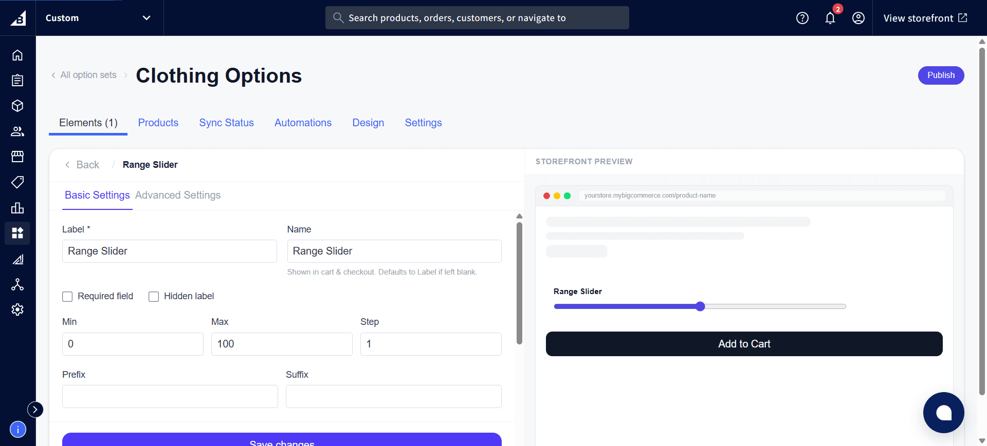
| Setting | Description |
|---|---|
| Label | Field label |
| Required | Customer must interact with the slider (move it away from the default) |
| Help text | Guidance below the slider |
| Default value | The initial slider position. Should be between Min and Max. |
| Min | Minimum selectable value. The slider cannot be dragged below this. |
| Max | Maximum selectable value. The slider cannot be dragged above this. |
| Step | Increment between allowed values. 1 snaps to whole numbers; 0.5 allows half-steps; 10 snaps to multiples of 10. |
| Prefix | Text displayed to the left of the value readout (e.g., $) |
| Suffix | Text displayed to the right of the value readout (e.g., cm, %, kg) |
Storefront behavior
- Renders as a styled horizontal slider with a live numeric readout showing the current value
- Dragging the handle updates the readout in real time
- The prefix/suffix wrap the displayed number (e.g.,
50 cm) - The number the customer selects is recorded on the order.