Setting Up the Personalizer
Step 1: Open a supported element
The Personalizer can be enabled on any of these element types:
- Text Input — customer’s typed text overlaid on the product image
- Text Area — multi-line customer text
- Color Swatch — selected swatch color shown as a tinted area on the product image
- Image Swatch — selected image overlaid on the product image
- File Upload — customer-uploaded image displayed in a defined region
Open the element you want the customer to personalize (e.g., “Your name” Text Input).
Step 2: Go to the Personalizer tab
In the element settings panel, click the Personalizer tab.
Step 3: Enable the Personalizer
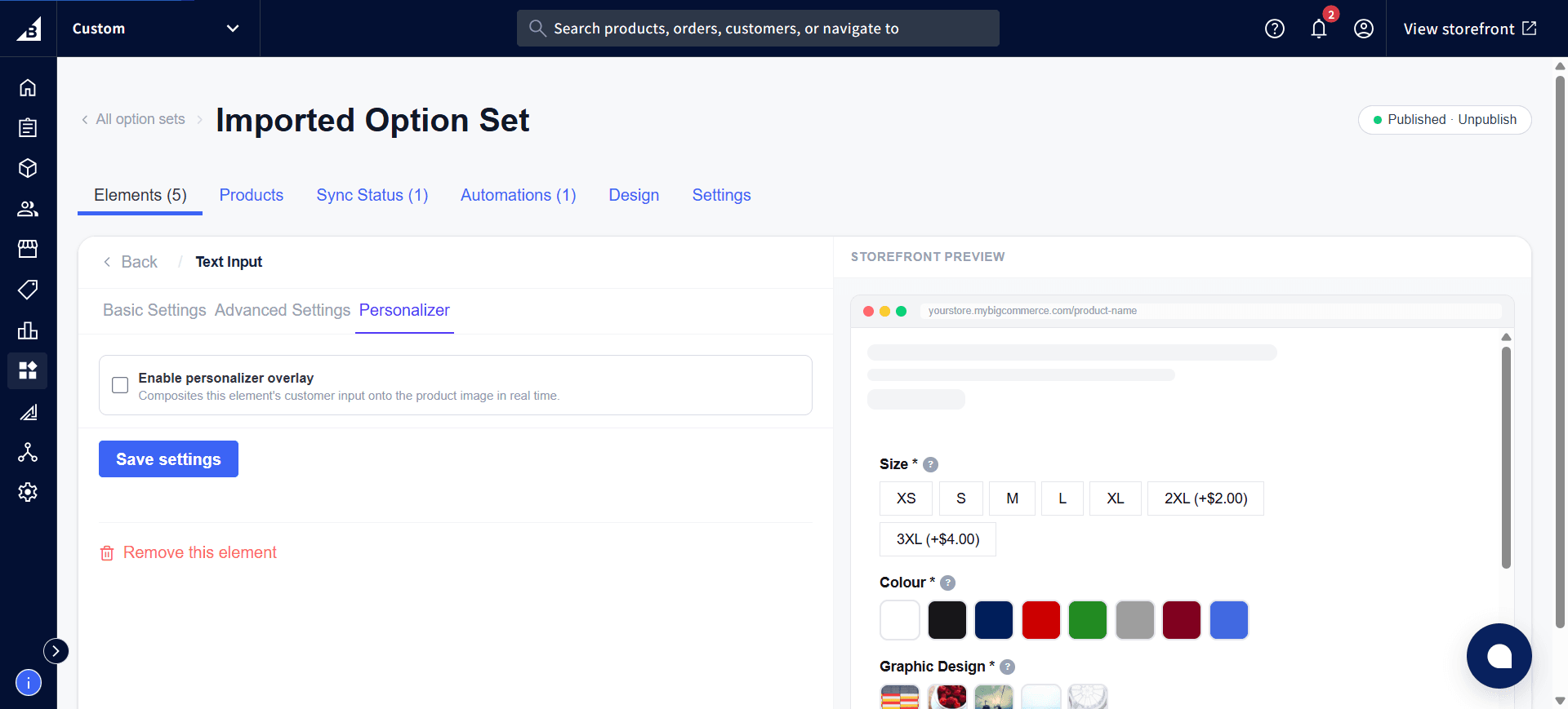
Check the Enable personalizer overlay box at the top of the Personalizer tab. This composites the element’s customer input onto the product image in real time. The settings panel expands to show all configuration options, and the right-hand preview switches from the normal Storefront Preview to a dedicated Personalizer Preview:
Step 4: Position the layer
Configure where the text layer appears on the product image, under Position & Size:
| Setting | Description |
|---|---|
| X position | How far the element appears from the left edge, as a percentage of the image width. Enter 50 to center it horizontally. |
| Y position | How far the element appears from the top edge, as a percentage of the image height. Enter 50 to center it vertically. |
| Width | Width of the bounding box as a percentage of the image width |
| Height | Height of the bounding box as a percentage of the image height |
Below Position & Size is a Transform group with Opacity (how see-through the layer is) and Rotation (the layer’s starting angle in degrees) — both are starting values the customer can then adjust further if drag/resize/rotate are allowed (see Customer Interactions):
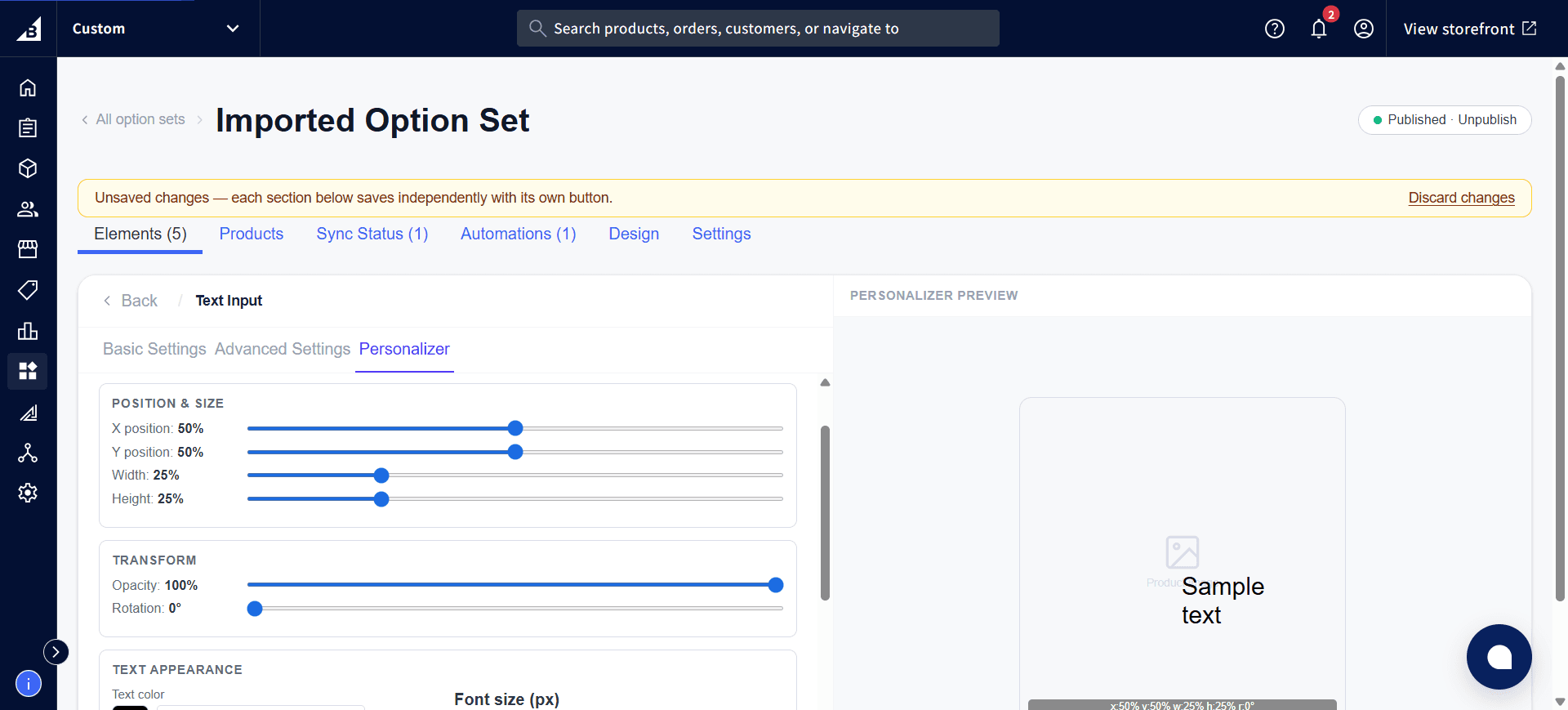
These values are percentages so the Personalizer scales correctly across different screen sizes and product image dimensions.
Step 5: Configure text appearance
| Setting | Description |
|---|---|
| Font family | The font for the text layer. Choose from Google Fonts or your Custom Fonts. |
| Font size | Text size in pixels |
| Font color | Color of the text |
| Font weight | Normal, bold |
| Text alignment | Left, center, right |
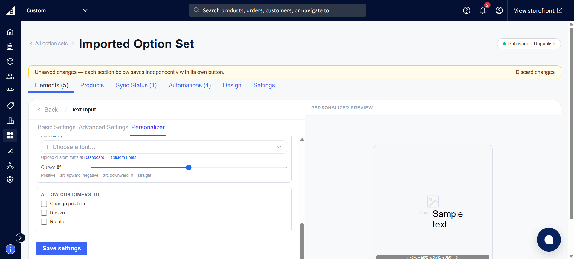
| Curve | Bend the text into a curve. Use 0 for straight text, a positive number to curve upward (like the top of a circle), and a negative number to curve downward (like the bottom of a circle). Higher numbers create tighter curves. |
Step 6: Configure customer interactions
Under Allow customers to, choose which interactions the customer is allowed to perform on the text layer:
| Setting | Description |
|---|---|
| Change position | Customer can reposition the text by dragging (this is the “Allow drag” behavior described in Customer Interactions) |
| Resize | Customer can resize the text bounding box using corner handles |
| Rotate | Customer can rotate the entire text layer using a rotation handle |
Step 7: Save and test
Click Save settings. Open the product page on the storefront. Type in the text input — the text should appear overlaid on the product image immediately.
Make sure the option set is Published (not Draft) before testing — draft option sets are not visible on the storefront.
Adding multiple Personalizer layers
You can enable the Personalizer on multiple elements within the same Option Set. Each becomes a separate layer on the canvas. For example:
- Text Input: “Line 1” → top-center of the product
- Text Input: “Line 2” → below Line 1
- Color Swatch: drives a color overlay layer
All of them appear stacked on top of each other on the product image at the same time.