Image Swatch
A grid of image thumbnails the customer clicks to choose an option. Use when visual comparison of the actual product material or pattern matters more than a color block.
When to use
- Pattern or texture selection (wood grain, marble, fabric pattern)
- Style variants where a photo is clearer than a color name
- Gift wrapping design selection
- Any option where seeing a real image per choice helps customers decide
General settings
| Setting | Description |
|---|---|
| Label | Field label |
| Required | Customer must select a swatch |
| Help text | Guidance below the swatches |
| Allow multiple | Lets the customer select more than one image simultaneously |
| Min selections | Minimum selections (with Allow multiple) |
| Max selections | Maximum selections simultaneously |
Values tab
| Field | Description |
|---|---|
| Label | Option name (shown as tooltip on hover and in the order) |
| Image | Upload or enter a URL for the thumbnail. Upload images at least 200×200 pixels for sharp display on high-resolution screens. |
| Default | Pre-selected on page load |
| Disabled | Strike-through/greyed out |
| Price | Add-on price for selecting this image |
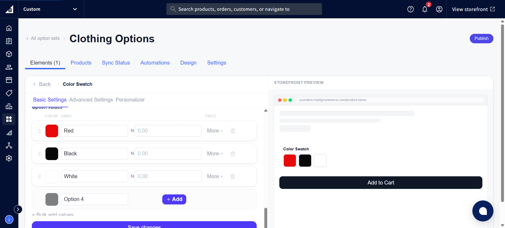
Here’s an Image Swatch element from a real, published option set — the Graphic Design field lets customers pick from actual pattern thumbnails, each with its own image, label, and price:
Display settings
Layout
| Option | Description |
|---|---|
| Vertical | Swatches flow vertically |
| Horizontal | Swatches flow in a left-to-right row |
| Slider | Swatches display in a carousel/slider |
Slider mode
| Setting | Description |
|---|---|
| Rows | Number of swatch rows visible at once in the slider |
| Per row | Swatches shown per row |
| Show navigation arrows | Left/right scroll arrows |
| Show indicators | Dot position indicators |
Tooltip on hover
| Setting | Description |
|---|---|
| Show tooltip on hover | Shows a tooltip when the customer hovers over a swatch |
| Tooltip style | Text only — just the label text; or Text & image — shows the label plus a larger preview of the swatch image |
Use “Text & image” tooltip when the swatches are displayed small but you want customers to see a larger preview on hover without needing to click.
Storefront behavior
- Renders as a grid (or scrollable row) of image thumbnails
- Selected swatch shows a highlighted ring border
- Tooltip (if enabled) appears on hover
Single selection
The selected option is recorded on the order. In the order: [Element label]: [Selected value label] — e.g. Pattern: Stripe.
Multi-select (Allow multiple on)
Each checked value appears as its own line on the order. In the order, every selected swatch appears as a separate line:
Pattern - Stripe: Yes
Pattern - Plaid: Yes
Unselected values are not listed. After toggling Allow multiple on or off, open the element in the admin and click Save — the app automatically updates the behind-the-scenes setup in BigCommerce.