Text Input
A single-line text field. The most common input type — suitable for names, short messages, engraving text, monograms, and any other short free-form entry.
When to use
- Customer name or initials for engraving/monogramming
- Short personalization message (e.g., “Happy Birthday Tom”)
- Custom reference or order number
- Any single-line custom field
For longer text, use Text Area.
General settings
| Setting | Description |
|---|---|
| Label | Field label shown on the storefront |
| Internal name | Admin-only label — not shown to customers |
| Required | Customer must enter a value before adding to cart |
| Hide label | Hides the label in the storefront UI |
| Help text | Short guidance below the field |
| Placeholder | Greyed-out hint text inside the input before typing |
| Default value | Pre-fills the field with this text |
All of these settings — plus everything below — live in one scrollable panel on the right side of the element editor, with the live Storefront Preview next to it:
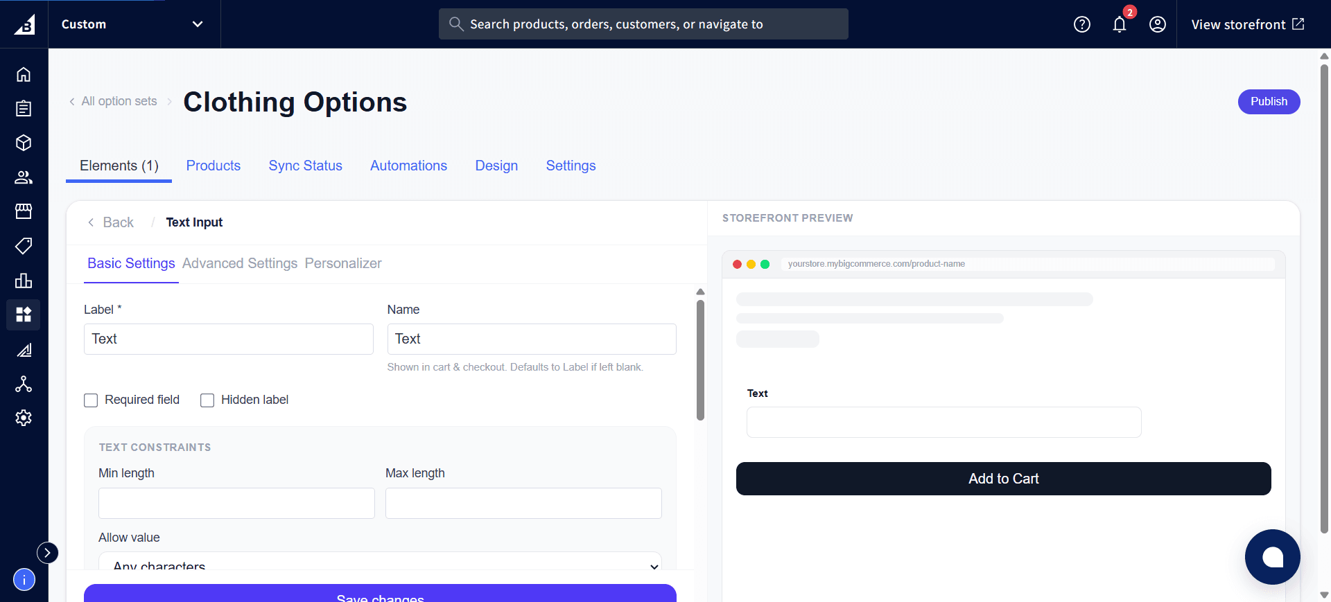
Text constraints
| Setting | Description |
|---|---|
| Min length | Minimum number of characters allowed |
| Max length | Maximum number of characters. A live character counter appears on the storefront once set. |
| Allow value | Restrict what characters can be typed: Any characters (default), Letters only, or Letters and numbers (no special characters or spaces) |
Scroll down in the same settings panel to find the Allow value options, along with Price per character and Text transform (covered below):
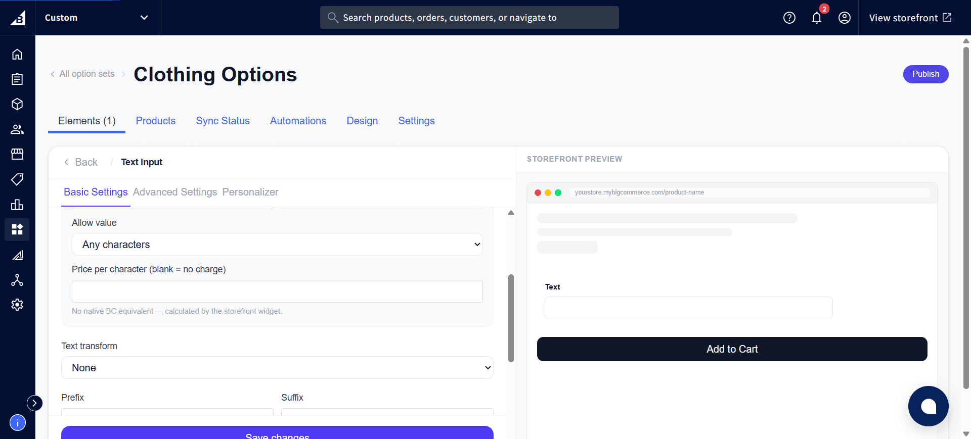
Text transform
| Setting | Description |
|---|---|
| Text transform | None (customer types as-is), Always uppercase (input is automatically uppercased), Always lowercase |
Useful for products where the final output is always in a specific case (e.g., a rubber stamp that only prints uppercase).
Prefix / Suffix
| Setting | Description |
|---|---|
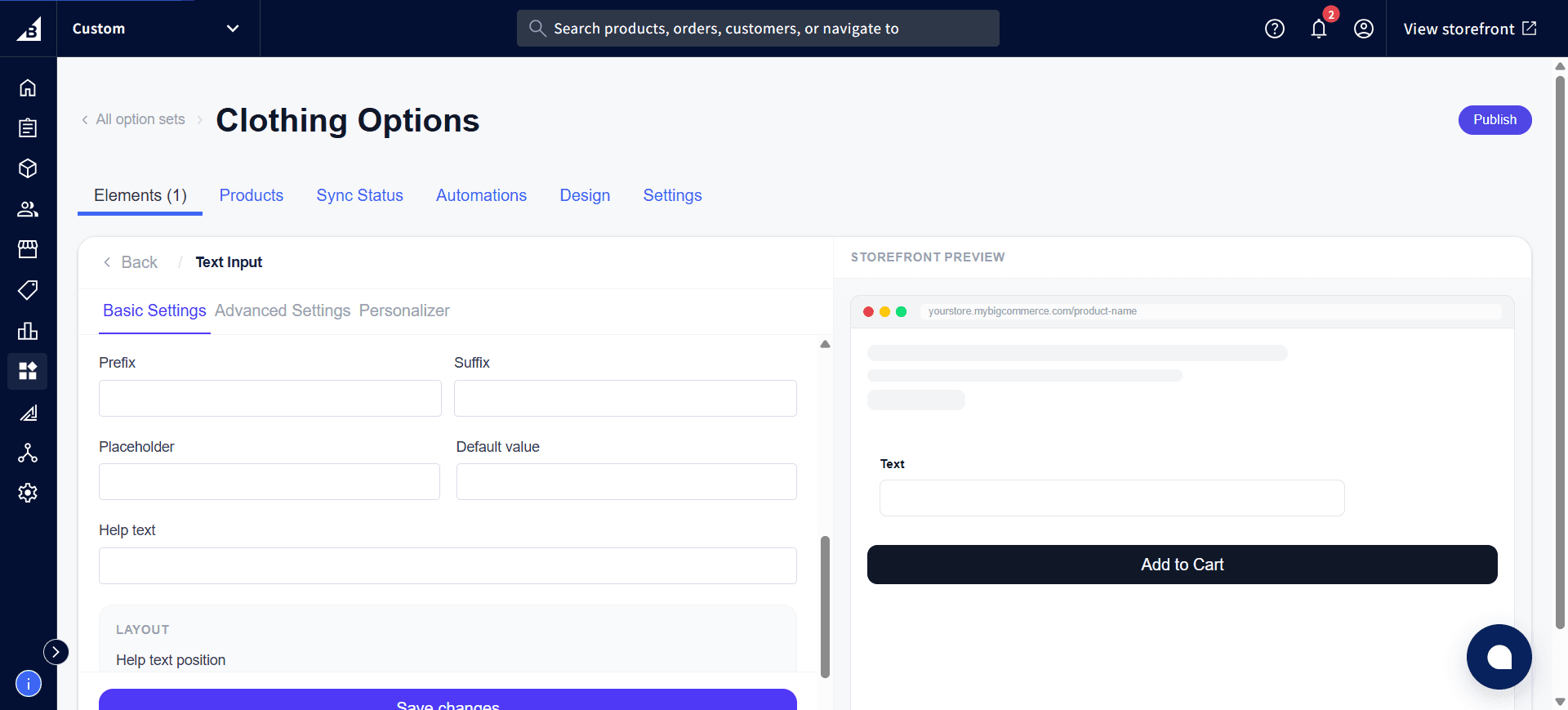
| Prefix | Fixed text displayed before the input field (e.g., # for hashtag, $ for currency) |
| Suffix | Fixed text displayed after the input field (e.g., cm, %, USD) |
Prefix and suffix are display-only — they appear in the UI but are not added to the submitted value. Scrolling further down the settings panel also shows the Placeholder, Default value, and Help text fields from the General settings table above:
Pricing
| Setting | Description |
|---|---|
| Price per character | A fee charged for each character the customer types. Leave blank for no per-character charge. See Per-Character Pricing for full details. |
Personalizer tab
When the Personalizer is enabled for this element, the typed text is rendered as a live overlay on the product image. See Product Personalizer for full setup.
Storefront behavior
- Displays as a standard single-line text box
- Live character counter shown when min/max length is configured
- Text transform is applied visually as the customer types
- Required validation fires on add-to-cart — field highlighted in red if empty
- The customer’s answer is recorded on the order.