Dropdown
A collapsed select menu. The customer clicks to open the list and picks one option. All choices are hidden until the customer opens the dropdown.
When to use
- Many choices (8+) where showing all at once would take too much space
- A compact field where a radio list would dominate the form
- Size charts with a long list of sizes
For fewer choices (2–6) where side-by-side visual comparison matters, use Radio Buttons or Button Group instead.
General settings
| Setting | Description |
|---|---|
| Label | Field label |
| Required | Customer must select a value (not the blank placeholder) |
| Help text | Guidance below the field |
| Placeholder | Text of the blank default option before a selection is made (e.g., “Select a size”) |
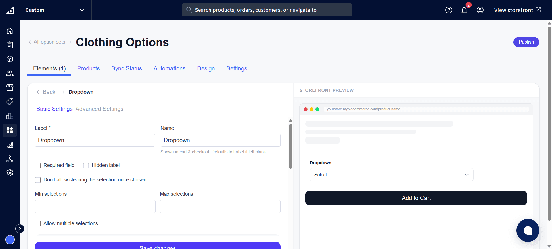
| Search suggestion | Adds a search box inside the dropdown — the customer types to filter the options list. Recommended when there are 10+ options. |
| Don’t allow deselect | Once the customer makes a selection, they cannot clear back to the placeholder. Useful when a value should always be set after first interaction. |
| Allow multiple | Turns the dropdown into a multi-select — the customer can pick more than one option. The dropdown stays open between picks. |
| Min selections | Minimum number of options to select (when Allow multiple is on) |
| Max selections | Maximum number of options selectable simultaneously |
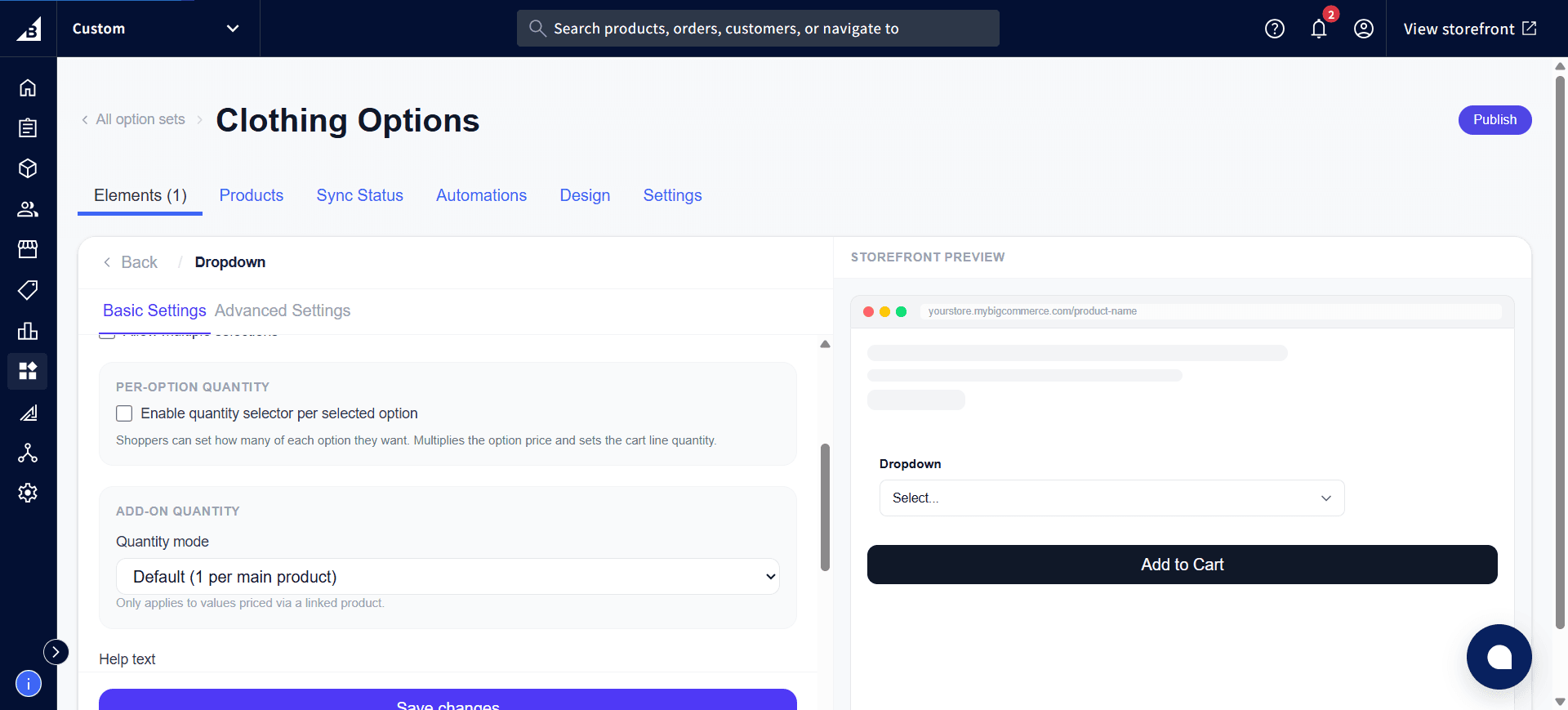
Scrolling down reveals two more sections — Per-Option Quantity (lets the customer set how many of a selected option they want, multiplying its price and setting the cart line quantity) and Add-on Quantity (only relevant for values priced via a linked product):
Values tab
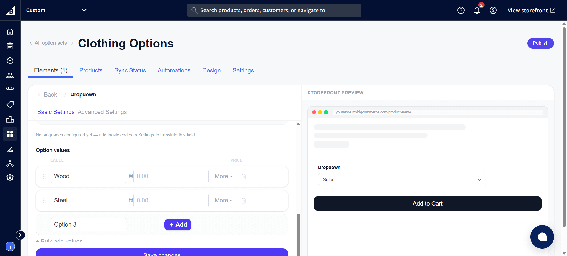
Each value is one option in the dropdown list:
| Field | Description |
|---|---|
| Label | Text shown in the dropdown list and in the order |
| Internal name | Admin-only |
| Default | Pre-selected when the page loads |
| Disabled | Greyed out in the list (e.g., out of stock). Customers can see it but cannot select it. |
| Image | Optional thumbnail shown next to the label in the open dropdown list |
| Price | Add-on price for selecting this option. See Add-On Pricing. |
Drag values to reorder them. Click + Add to add another value, or use Bulk add values to paste in a list at once:
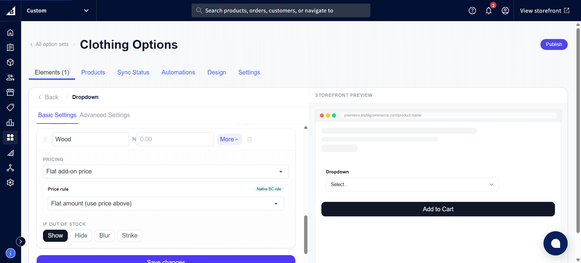
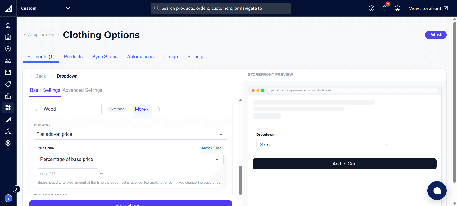
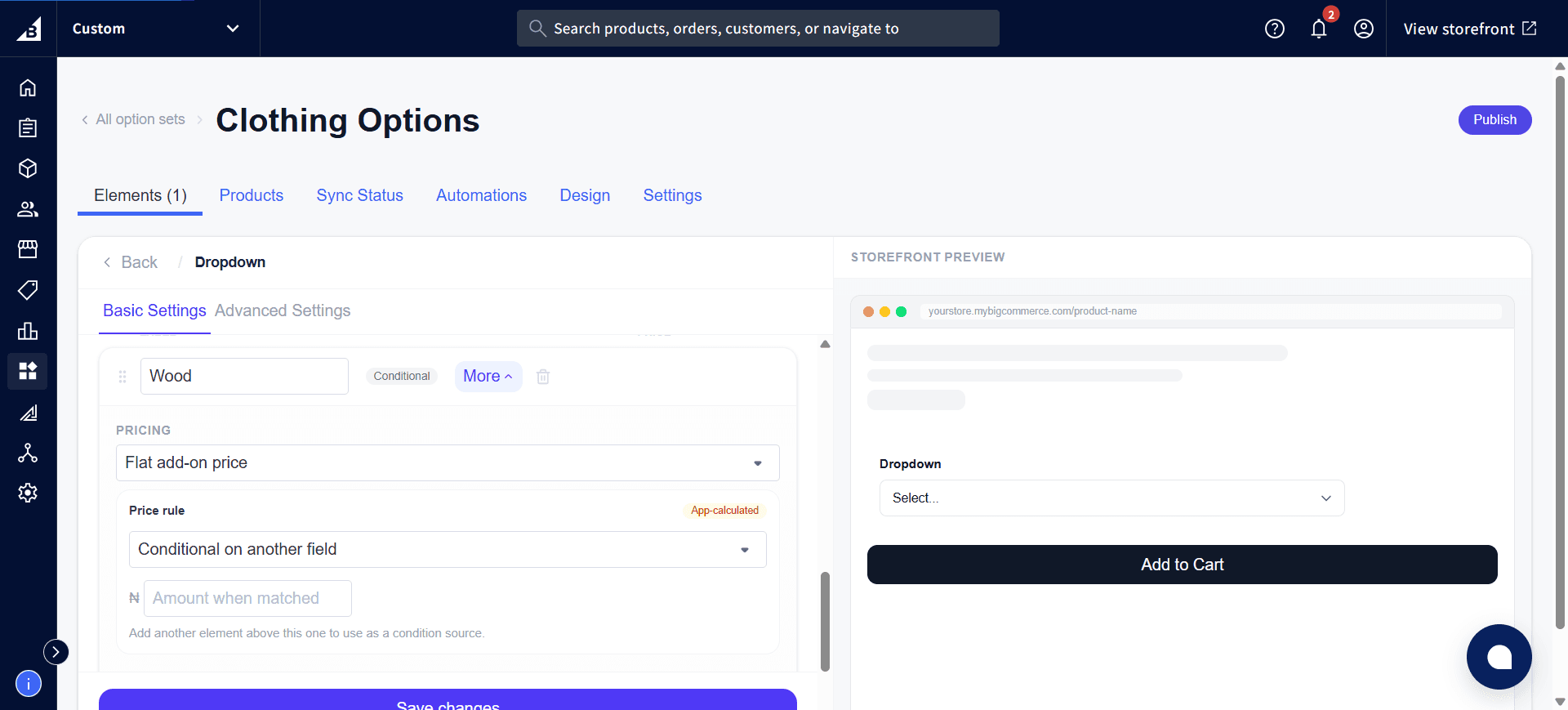
Click More on any value to expand its pricing options. The Price rule dropdown controls how that value’s price is calculated:
| Price rule | Badge | Description |
|---|---|---|
| Flat amount | Native BC rule | Uses the price you entered directly |
| Percentage of base price | Native BC rule | Charges a percentage of the product’s base price instead of a fixed amount |
| Conditional on another field | App-calculated | Only charges this price when another element on the same option set matches a condition you set |
Each value also has an If out of stock setting — Show, Hide, Blur, or Strike — controlling how it appears if the linked inventory runs out.
Storefront behavior
- Displays as a custom-styled dropdown menu.
- With search enabled: a search input appears at the top of the open list
- Multi-select shows selected values as removable tags in the trigger
Single selection
The selected option is recorded on the order. In the order the line reads: [Element label]: [Selected value label] — e.g. Size: Large.
Multi-select (Allow multiple on)
Each checked value appears as its own line on the order. In the order, every selected value appears as a separate line:
Size - Small: Yes
Size - Large: Yes
Unselected values are not listed. After toggling Allow multiple on or off, open the element in the admin and click Save — the app automatically updates the behind-the-scenes setup in BigCommerce.