Design & Appearance
The Design tab on each Option Set controls the visual style of the options widget (the panel of options that appears on your product page) on the storefront. You can make it match your store’s theme precisely — or give it a distinctive look — without touching any theme code.
Accessing design settings
Open any Option Set → click the Design tab. Inside it are four sub-tabs — Presets, Layout, Colors, and Typography — plus a Save button that applies whichever sub-tab you’re on. Changes are previewed live in the right-hand Live Preview panel.
See Design Presets for the Presets sub-tab, which lets you apply a full built-in theme in one click instead of configuring colors and typography individually.
Layout
Controls spacing and the overall size of the options form.
| Setting | Description |
|---|---|
| Form Width | Small, Medium, Large, Extra Large, Full Width, or Custom |
| Internal Padding | Space inside the form container — None, Small, Medium, or Large |
| External Margin | Space around the outside of the form container — None, Small, Medium, or Large |
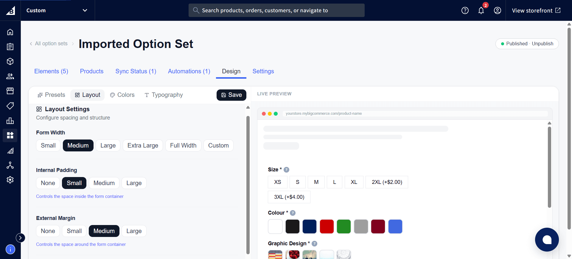
Scroll further down the Layout sub-tab for additional spacing controls, such as the gap between elements.
Colors
Controls every color used in the widget. Each color field has a hex input plus a grid of Quick Colors swatches for fast picking.
| Setting | Description |
|---|---|
| Background Color | Background of the form container |
| Text Color | Color of all text elements in the form |
| Primary Color | Used for buttons, focus states, and accent elements |
| Border Color | Default border color throughout the form |
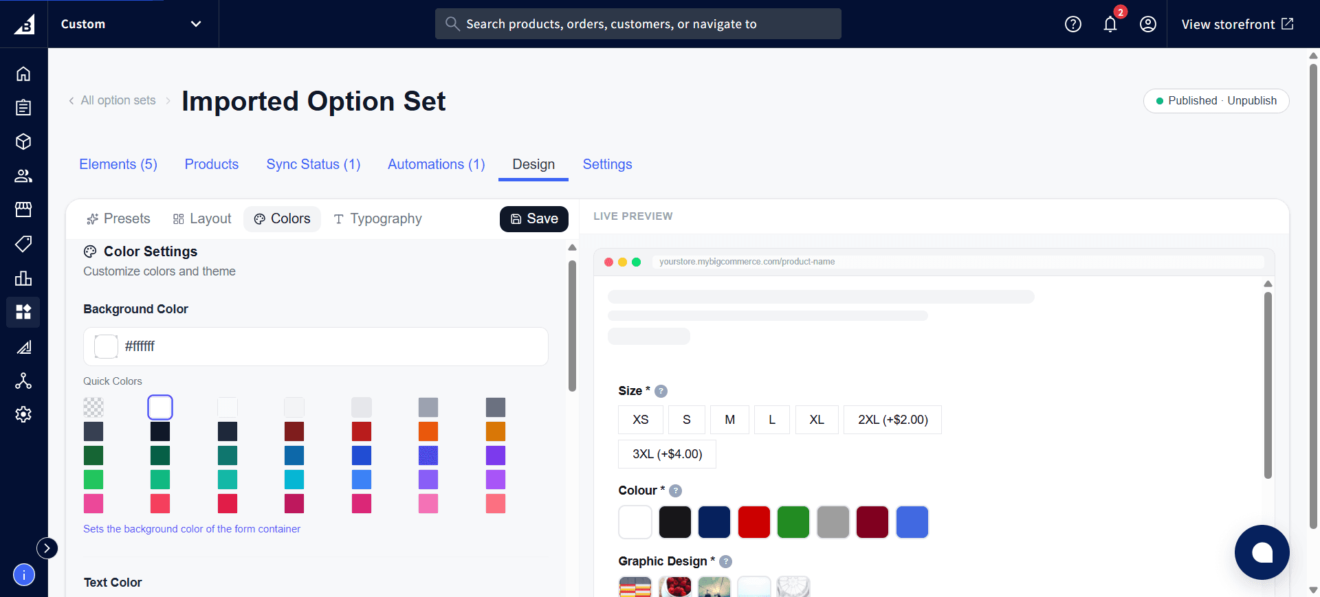
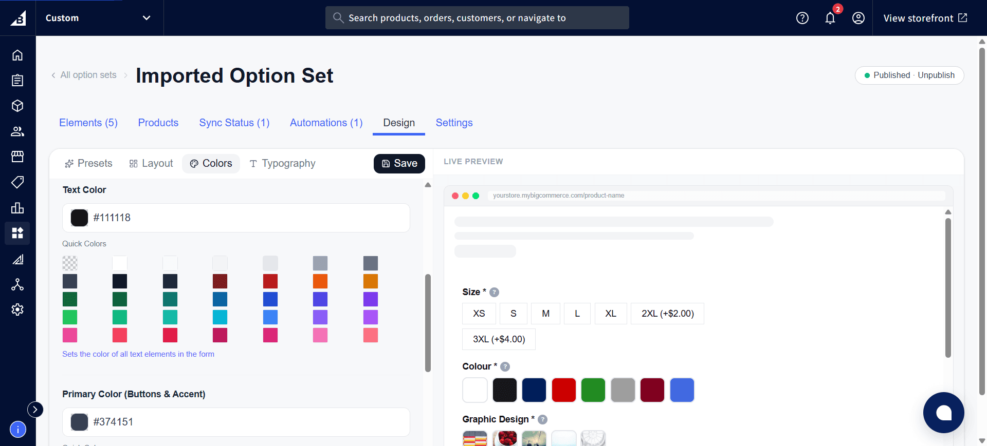
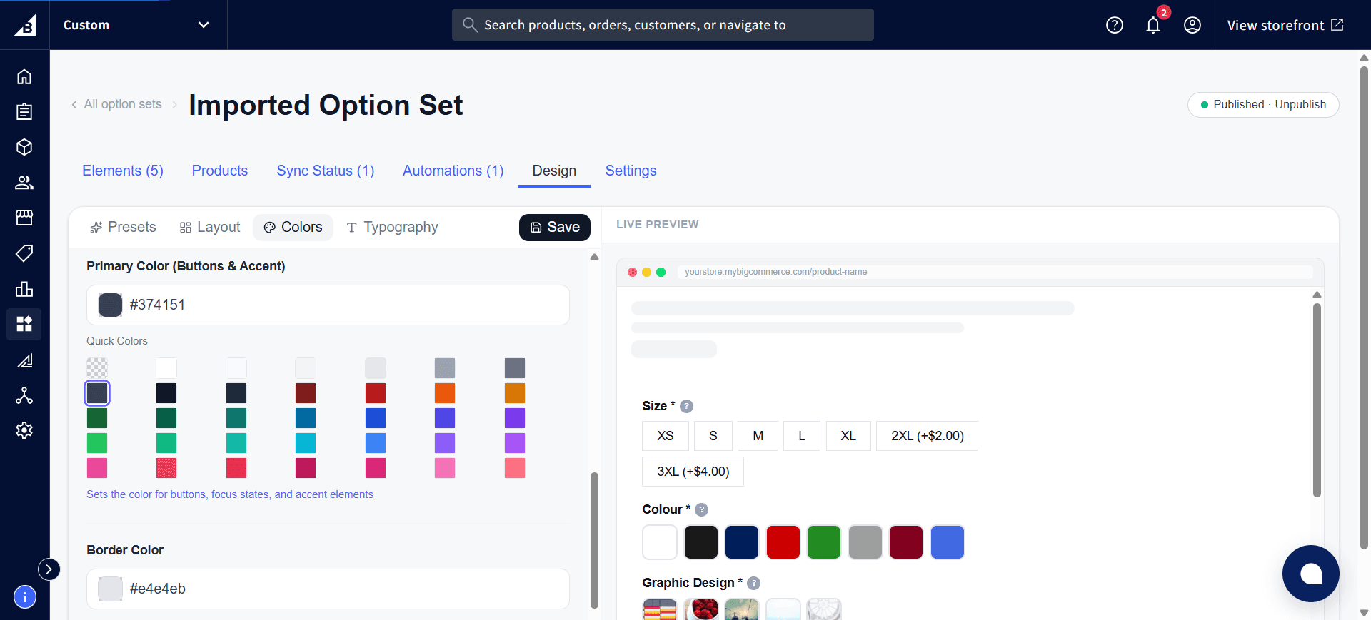
These four colors drive the whole widget’s palette — background, all text, buttons/focus/accents, and borders. Scroll further down the Colors sub-tab for any additional color fields specific to swatches, buttons, or error states.
Typography
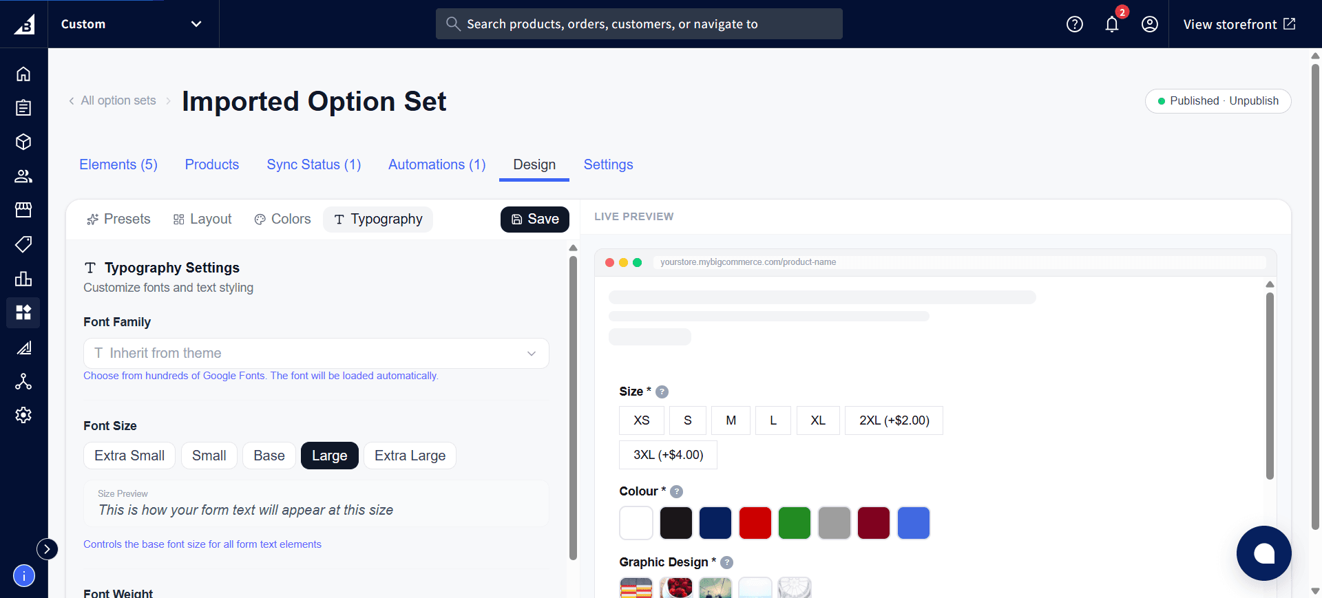
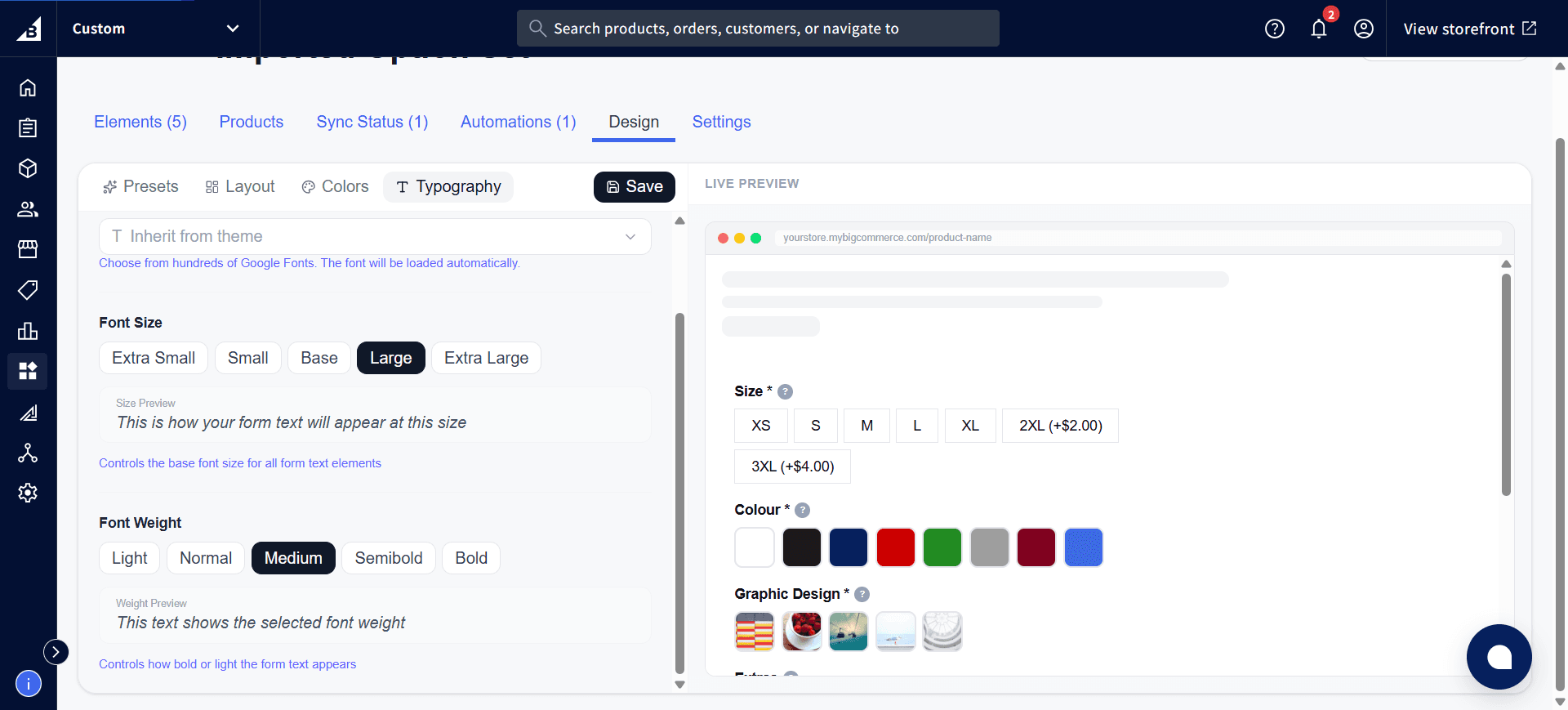
| Setting | Description |
|---|---|
| Font Family | Inherit from theme (default), or choose from hundreds of Google Fonts — loaded automatically |
| Font Size | Extra Small, Small, Base, Large, or Extra Large — controls the base font size for all form text elements |
| Font Weight | Light, Normal, Medium, Semibold, or Bold |
Each option shows a live text sample as you choose, so you can confirm readability before saving:
Per-element design overrides
Each element’s own Design tab lets you override colors and typography for that specific element only. For example, you might want most labels in dark grey but a specific label in red — override just that element without changing the rest of the option set.