Size Chart
A clickable trigger that opens a size guide in a modal overlay. The customer clicks a link or button on the product page to view the chart without leaving the page or losing their option selections.
When to use
- Apparel products where customers need to check their size before selecting
- Footwear, hats, gloves, or rings where fit guidance matters
- Any product with multiple size-related options that customers struggle to choose without a reference
The Size Chart is a display element — it has no value, doesn’t block the cart, and doesn’t submit anything to the order.
Trigger settings
The trigger is the visible element on the product page that opens the chart.
What to show
| Option | Description |
|---|---|
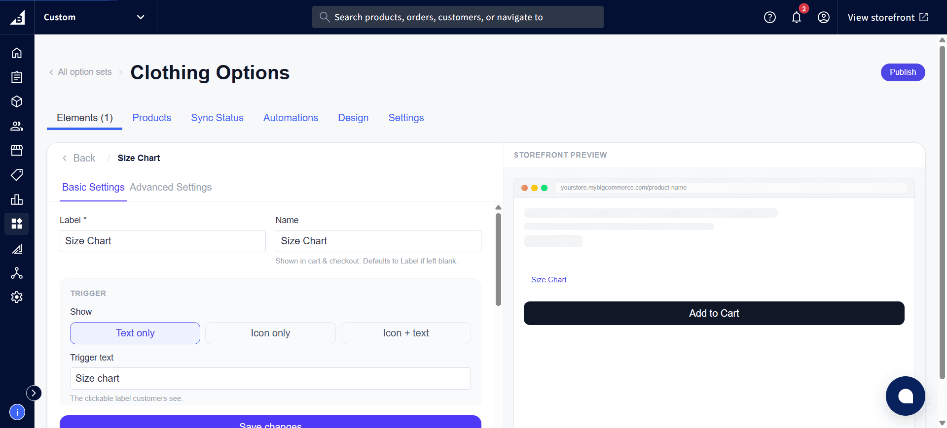
| Text only | Just the trigger text — renders as a plain inline link or button |
| Icon only | Just an icon, no label — use when space is very tight |
| Icon + text | Icon and text side by side |
Trigger text
The clickable label customers see. Default: “Size chart”. Customize to “View size guide”, “Sizing help”, etc.
Icon
Available when “Icon only” or “Icon + text” is selected. Choose from built-in icons:
| Icon | Description |
|---|---|
| Ruler | Classic ruler icon |
| T-shirt | Clothing outline |
| Custom | Upload your own icon image via URL |
Icon position (Icon + text only)
- Before text — icon appears to the left of the label
- After text — icon appears to the right of the label
Trigger style
| Style | Appearance |
|---|---|
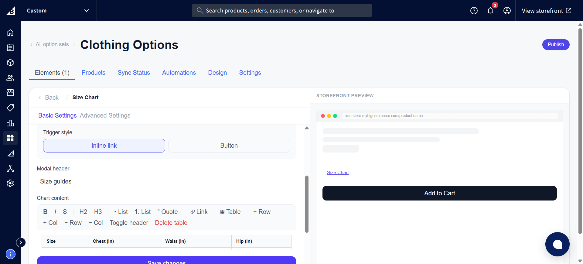
| Inline link | Renders as a text hyperlink placed inline with the surrounding content. |
| Button | Renders as a styled button with border and padding |
The What to show and Trigger text settings are at the top of the settings panel:
Scroll down for Trigger style, Modal header, and the Chart content editor toolbar:
Modal settings
Modal header
The title shown at the top of the modal dialog. Default: “Size guides”.
Chart content
The full size chart content, edited with a rich text editor. You can:
- Type text and apply bold, italic, underline, headings
- Insert HTML tables for the size rows and columns
- Paste formatted content directly
- Switch to raw HTML view for precise control (requires knowledge of HTML table formatting).
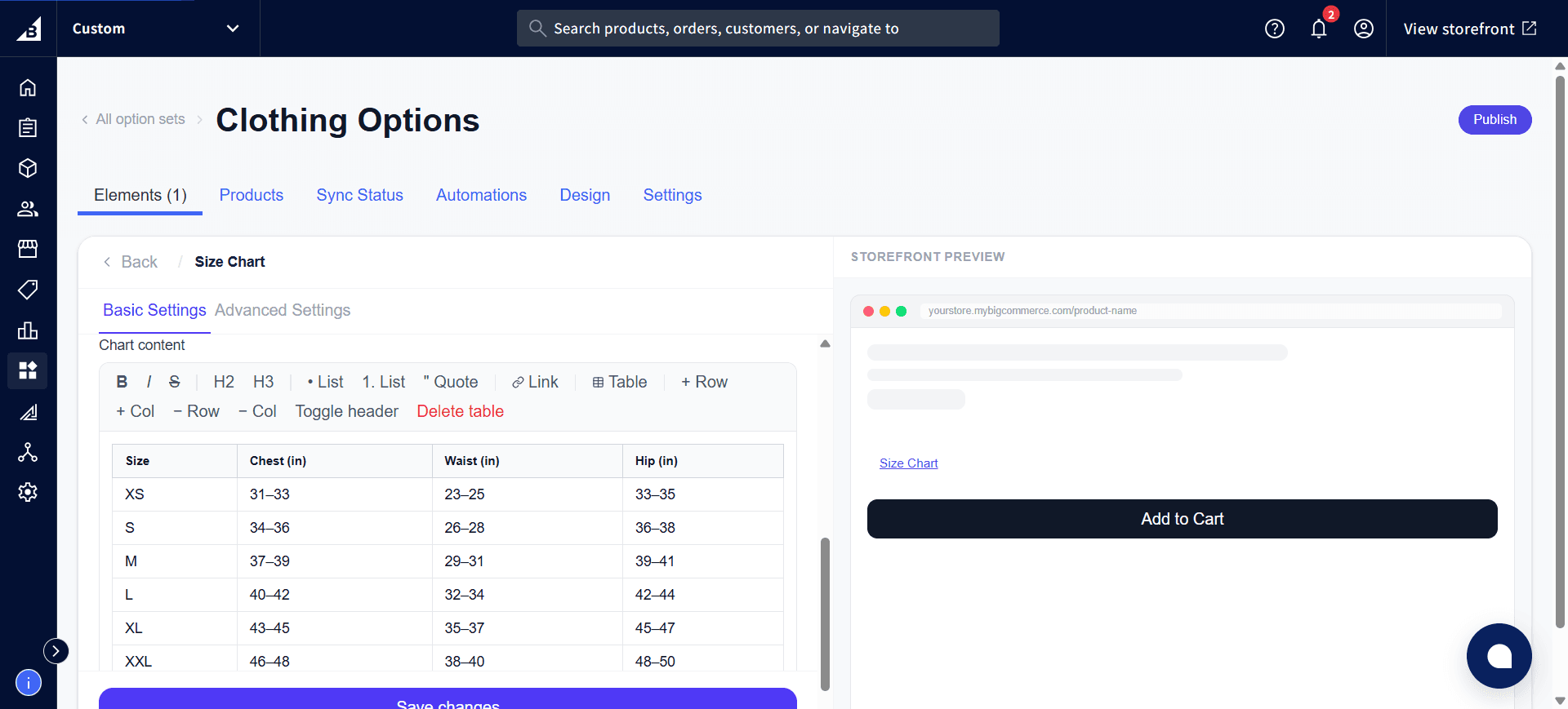
A default starter table is provided when a new Size Chart element is created. Edit it to match your product’s actual sizing.
Example content:
| Size | Chest | Waist | Hip |
|------|-------|-------|-----|
| S    | 34–36 | 28–30 | 36–38 |
| M    | 38–40 | 32–34 | 40–42 |
| L    | 42–44 | 36–38 | 44–46 |
A filled-in chart table looks like this in the editor:
Storefront behavior
- The trigger renders in the position where the Size Chart element sits in the element list — typically placed just above or below the size selection element
- Clicking the trigger opens a centered modal overlay with a close button
- The modal does not affect any element values — it’s purely informational
- The modal closes when the customer clicks the X button, clicks outside the modal, or presses Escape
Tips
- Place the Size Chart element immediately before or after the size selection element (Dropdown, Radio Buttons, etc.) so customers see it right when they need it
- For products with multiple size dimensions (e.g., a dress that has both size and cup size), you can add multiple Size Chart elements, each with its own chart content
- Use conditional logic to show a different Size Chart based on what the customer selects (e.g., show different charts for “Adult” vs. “Kids” selections)