Pop-up / Modal
A clickable trigger that opens custom rich-text content in a modal overlay. Similar to Size Chart, but for any general-purpose content instead of a sizing table — terms and conditions, care instructions, a product story, or anything else worth showing without leaving the page.
When to use
- Care or washing instructions for apparel
- Material sourcing or “how it’s made” content
- Terms specific to a customizable product (e.g., proof approval policy)
- Any supporting content that would clutter the product page if shown inline
For a dedicated sizing table, use Size Chart instead — it has the same trigger/modal pattern but with a table-focused editor.
General settings
| Setting | Description |
|---|---|
| Label | Field label shown above the trigger |
| Name | Internal name — not shown to customers |
Trigger settings
| Setting | Description |
|---|---|
| Trigger style | Button, Text link, or Button + link |
| Trigger label | The clickable text shown on the page (e.g., “View details”) |
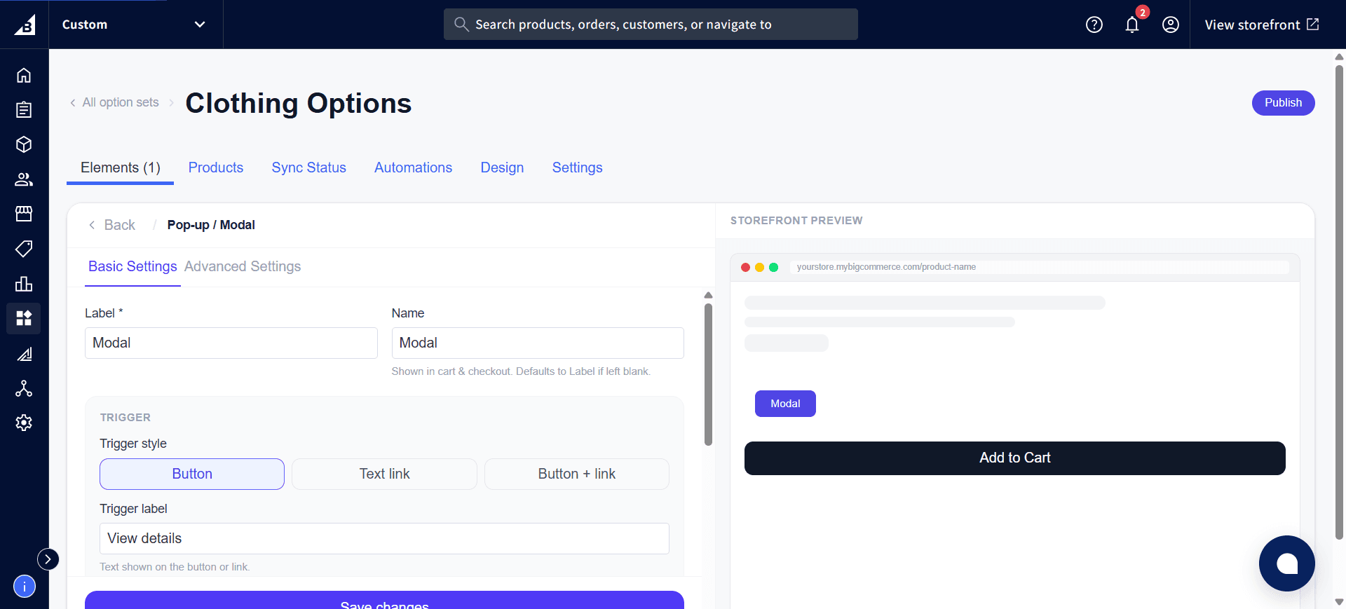
Modal content
| Setting | Description |
|---|---|
| Modal title | Optional heading shown at the top of the pop-up |
| Modal content | The body content, edited with a rich text editor — supports bold/italic/strikethrough, headings, lists, quotes, links, images, and tables |
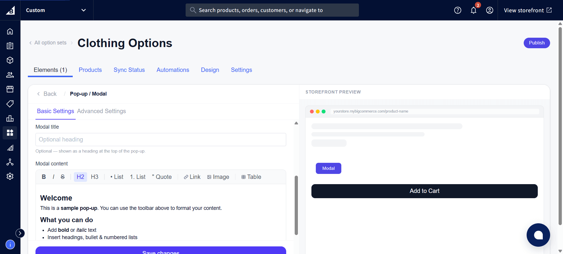
A new Pop-up / Modal element starts with sample placeholder content in the editor — replace it with your own text, formatting, and images.
Storefront behavior
- The trigger renders in the position where the element sits in the element list
- Clicking the trigger opens a centered modal overlay with a close button
- The modal does not affect any element values — it’s purely informational
- The modal closes when the customer clicks the X button, clicks outside the modal, or presses Escape
- Pop-up / Modal is a display element — it does not submit a value to the cart or appear on the order.