Number
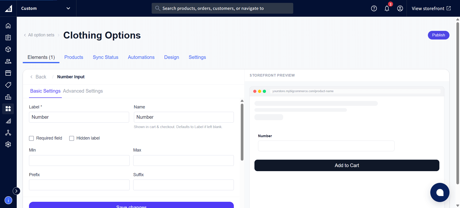
A numeric input field with optional minimum, maximum, and step constraints. Also supports prefix/suffix labels.
When to use
- Quantity of a sub-component (e.g., “Number of candles”)
- Ring size, shoe width, or other numeric measurements
- Custom dimensions where a typed number is more practical than a slider
For a draggable slider experience, use Range Slider instead.
General settings
| Setting | Description |
|---|---|
| Label | Field label |
| Required | Must be filled before add to cart |
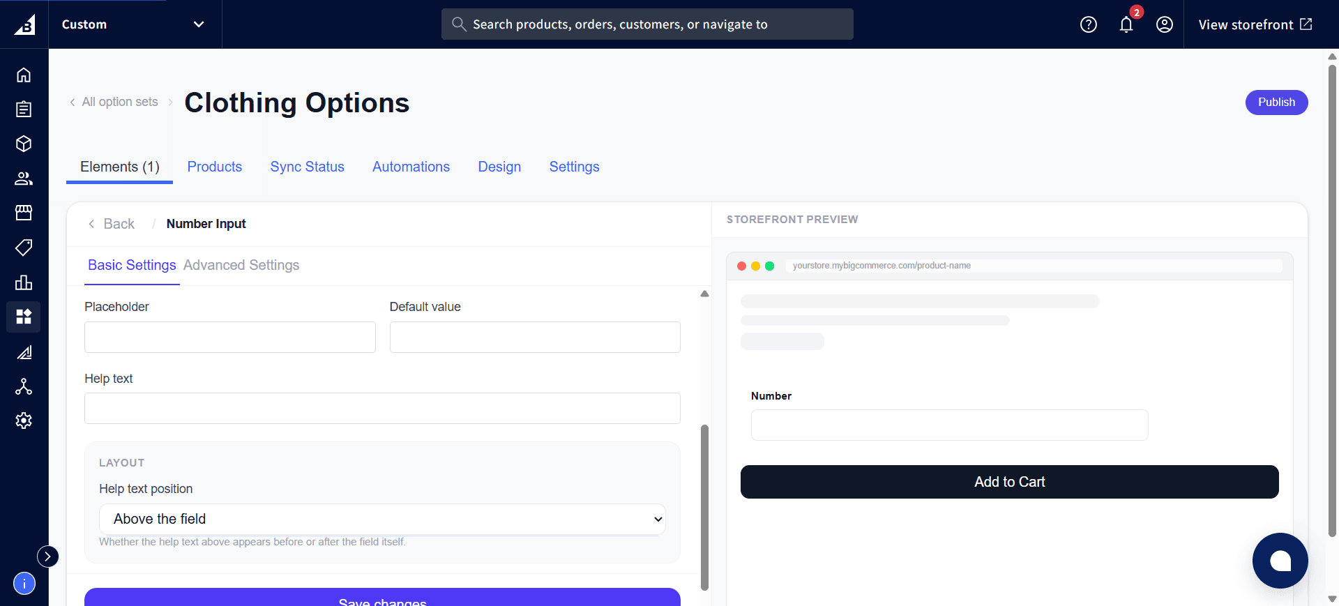
| Help text | Guidance below the field |
| Placeholder | Hint text inside the input |
| Default value | Pre-filled numeric value |
| Min | Minimum value allowed (inclusive) |
| Max | Maximum value allowed (inclusive) |
| Prefix | Display text before the input (e.g., $) |
| Suffix | Display text after the input (e.g., cm, lbs) |
Scroll down in the same settings panel for Placeholder, Default value, Help text, and the Layout section:
Storefront behavior
- Displays as a number field with up/down arrows the customer can click.
- Validation runs when the customer moves away from the field, and again when they click Add to Cart.
- Prefix and suffix are displayed inline but not submitted as part of the value
- The number the customer enters is recorded on the order.